Top to bottom funnel
Project Type
End-to-end
Redesign
User Flow
My Role
UX Manager
Lead Designer
Outcome
Contribution
User Research
Interface Design
Stakeholder Management
Lead team of 2 UXDs
Project Management
23% increase in applications completed
15% increase in registered users
Overview
My Role
Nomad Health is a 2-sided marketplace for Travel Nurses and Hospitals. We connect travel nurses to the highest paying jobs in the industry. We do this by removing unnecessary overhead through an automated application process.
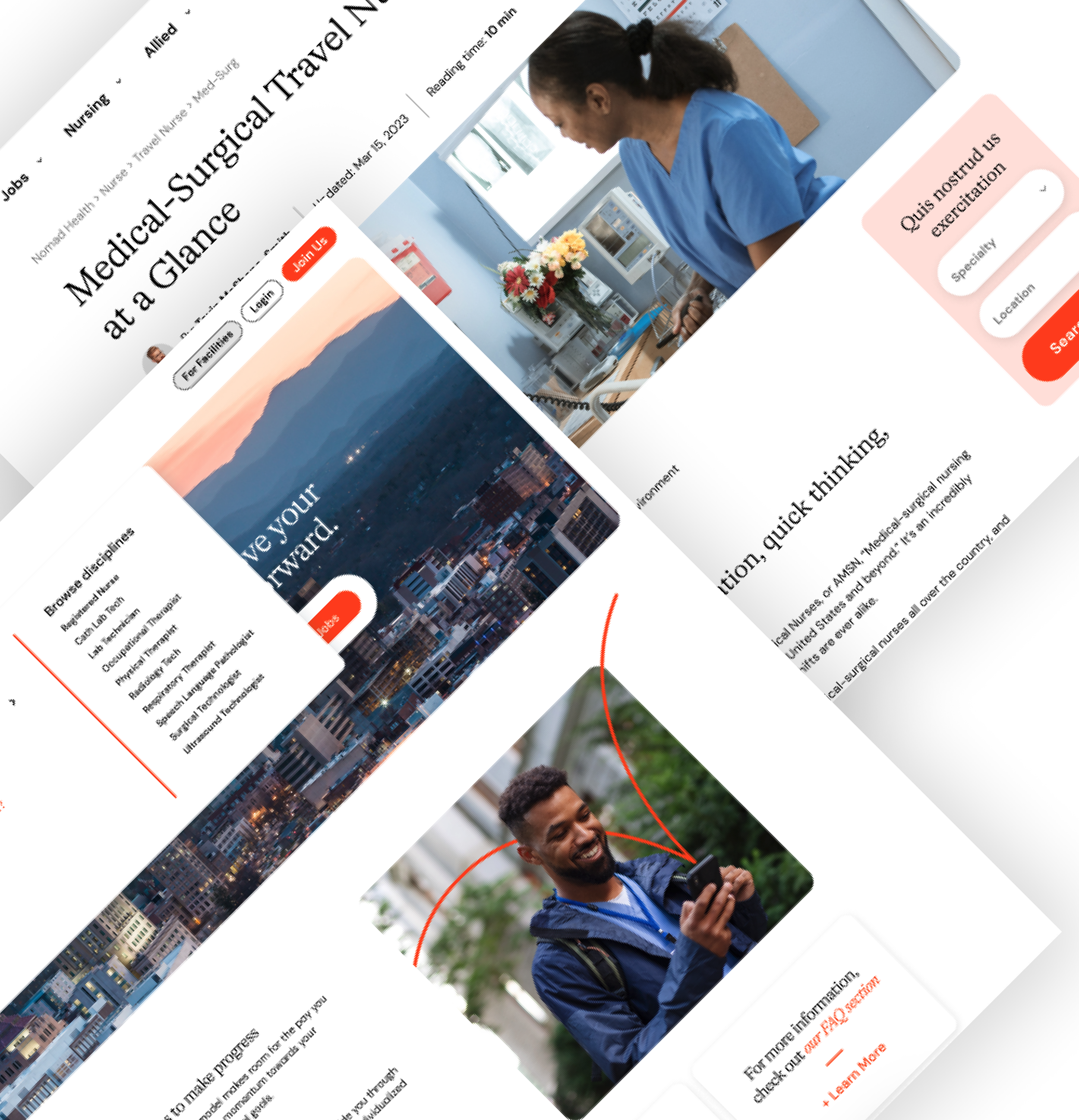
In summer of 2023, we wrapped up a massive rebrand effort. It in included collaboration from every team in the company. My role (and my teams) was to oversee the top of the funnel including the flow and layout of our public facing website, job search, registration, and profile.
We have taken a clinical brand and done some really great, emotional branding that has been resonating with our users. We have lots more updates coming soon as well that will help change the game for Travel Nurses.
We created desktop and mobile specific versions, ensuring all breakpoints represented the brand and our content in the best possible way.
The website is live now at: www.nomadhealth.com
As UX Manager, my role was that of player-coach. While overseeing 2 designers that covered Mobile and Job Search, respectively; I was directly in charge of the customer acquisition, conversions, and application completion process.
Defining the problem

Problems for users
Problems for the business
Goal
Through our SEO and marketing efforts we were able to acquire 30,000+ new users each month. We had two primary goals for each user:
Get registered
Complete an application
Our previous user journey was a walled garden that forced a user to register before they could view jobs. This led to high-intent users who really wanted to see jobs.
Our primary assumption was that if we converted to an open job view (not registering first), we would increase users and therefore more registers and applications.
Need to register to see jobs
Long, unnecessary onboarding flow
Filtered results often showed “no results”
Large bounce rate on homepage
Low users registering for jobs
Unnecessarily low placements due to “walled garden” mentality
Increase customer acquisition
Open up job search to unregistered users
Increase conversions (registers and application completion)
Solutions
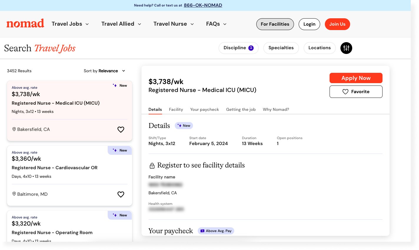
Job search is the focus

Simple, contextual onboarding

Application Redesign


Originally, we had a “walled garden” approach, every user had to register and go through a lengthy onboarding process that usually resulted in a “no results” search.
We redesigned the homepage and job search page to reflect our thousands of jobs and our USP of the highest salaries in the industry.
We completely removed our onboarding screens which asked for a lot of unnecessary information upfront (degree, years of experience, licenses, etc). We moved to a scenario where we would capture that data as they filtered their search and through the application.
Too many apps front-load their onboarding to their users. This leads to lower conversion rates. There is no reciprocity when a product asks everything of its users and offers nothing back. In this case, we flipped that script and offered our users a free job search, job details, and salary. When the user went to “unlock” the facility name, they entered a registration flow.
This flow led to an increase of 15% in registered users.
The original application was a visual disaster!
It was overloaded with red error states, users had to scroll an entire screen just to begin entering information, and it had a horrible completion rate.
Through my years of experience in UX, common sense, and visual design acumen; I was able to redesign and layout the application experience.
Some highlights:
Fixing our notification system - originally any un-entered data registered as an “error”.
Adjusting color schemes - blue became our primary way of informing users that there was something unique on this screen. Everything else was toned down to expose more white space.
When specific requirements were needed, they were highlighted in lavender.
These changes (and a few more backend adjustments) led to an immediate 23% increase in application completions!
outcomes
30,000Registered Users each month
23%Increase in application completion
15%Increase in registered users